Indonesian startup decacorn Go-Jek has changed its iconic logo as the company solidifies its transition from humble ride-sharing app into the all-encompassing super app we know today.
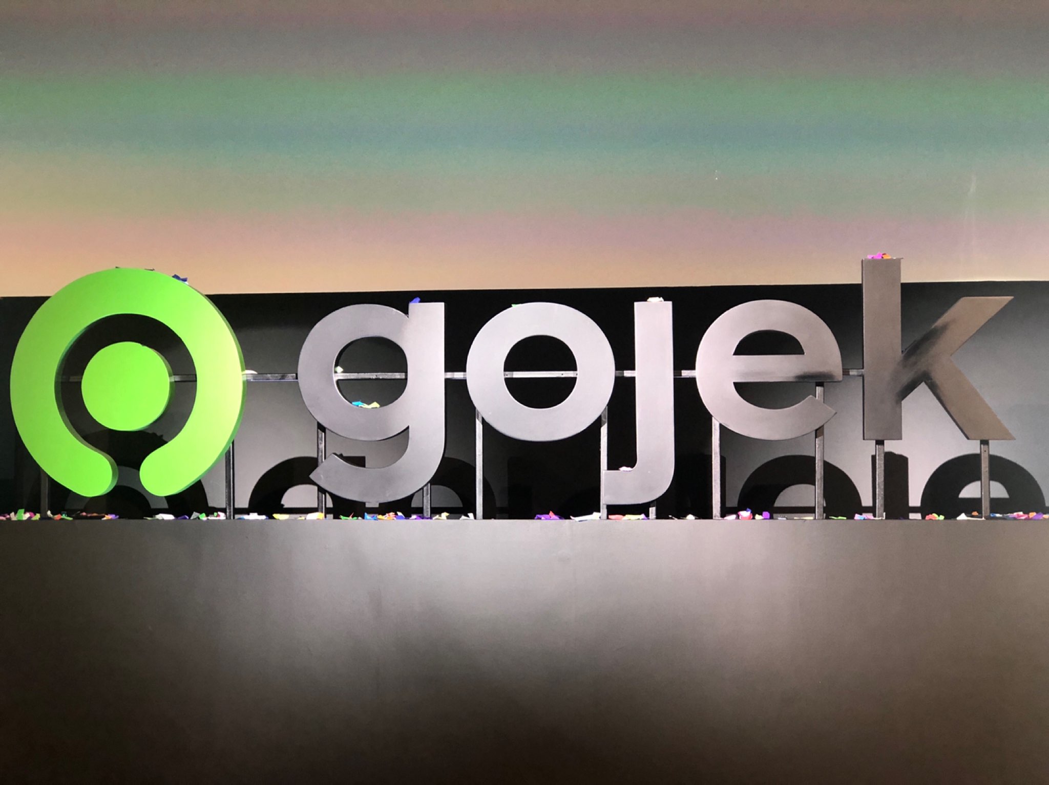
At a press conference this morning, Go-Jek founder and CEO Nadiem Makarim announced that the company is undergoing a rebranding process, which includes the introduction of a new logo that resembles a button, while keeping the brand’s signature green hue.
“The new logo is inspired by the reason why Go-Jek exists, to solve problems through technology. It symbolizes one button for all,” Nadiem said.
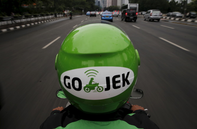
Before the change, Go-Jek’s logo was a drawing of a motorcycle taxi driver, which represented the company’s beginning as a motorcycle taxi hailing app.

Nadiem said the logo was changed to represent all services under Go-Jek, which includes car-hailing service Go-Car, food delivery service Go-Food and a variety of other on-call services, including massage and cleaning, under Go-Life. As such, the new logo is aptly called “Solve”. Nadiem also said it’s supposed to look like a bird’s eye view of a Go-Jek motorcycle taxi driver as seen from above (we think it looks a lot like a green version of the logo of US retail giant Target, but that’s just us…)

Aside from introducing the new logo, Nadiem and fellow Go-Jek executives, including co-founder Kevin Aluwi and group president Andre Soelistyo, announced the most recent milestones in the company’s nine-year history. According to them, Go-Jek now has over 2 million driver partners, 400,000 partner merchants and 60,000 service provider partners in Southeast Asia.
More transportation and tech news by Coconuts Jakarta


