
Let’s be honest, the MRT map designed by transport officials here looks tidy and clean cut — optimised for aesthetics and readability — but it’s not an accurate representation of our geographic reality.
Over in Reddit’s Data Is Beautiful subreddit, the information enthusiasts have been going nuts with the making of GIFs that transform official subway maps into how they look like IRL. Here’s the representation of Berlin’s subway map:
Here’s the New York City subway:
Here’s Shanghai:
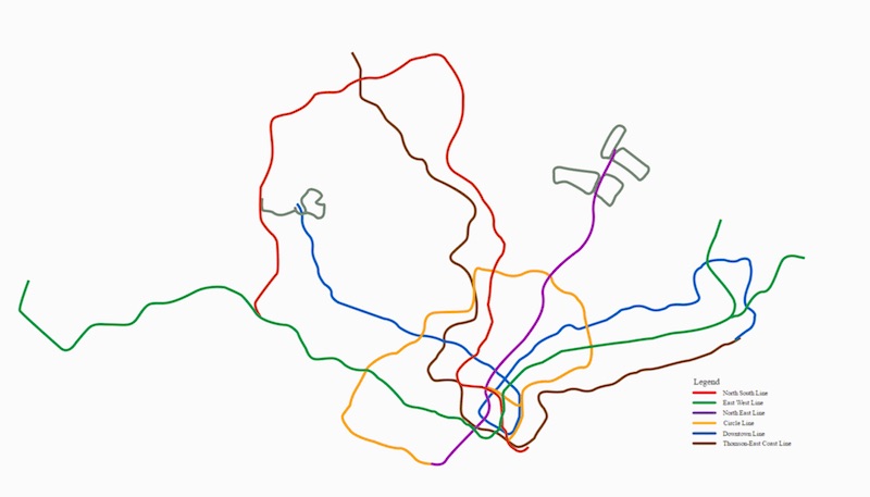
Aaaand here’s Singapore:
It was done up by Redditor /u/wrcyn, who explained that Adobe Illustrator was used to draw out the lines, which were then imported into Adobe After Effects to animate the Land Transport Authority’s map into a geographically accurate one. That’s not to say that the MRT map that we’re used to is wrong per se — it’s just cleaned up for maximum legibility and minimal confusion. But it is fascinating to see how strikingly different they are.

