
Aside from the recent spate of delays and disruptions on SMRT’s North-South Line, commuters might have also noticed the new trains that’ve rolled out, complete with sleek exteriors and high-tech interiors.
But if you’ve also noticed how off-putting the train’s new LCD display panels are, you aren’t the only one.
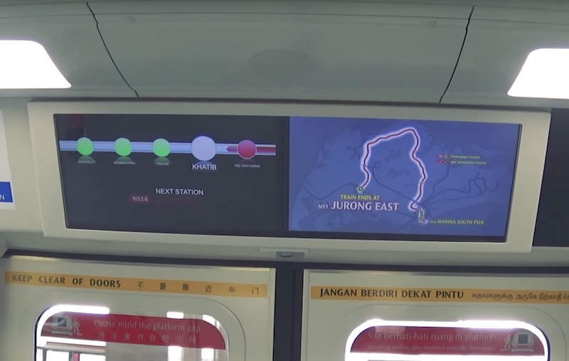
Some context: The first of the 57 new trains have begun service on the red line, and these trains have been fitted with display screens providing information on landmarks and places of interest near MRT stations. These screen replace the standard route map that show the train’s direction.
Certainly sounds exciting on paper, but as it turns out, its interface is both an eyesore and definitely not user-friendly. “…the actual execution of the display was so bad it makes for a perfect case study of how bad design can destroy a great idea,” wrote visual designer Yu Siang Teo in a brilliant story on Tech In Asia. Read the whole piece, and check out some highlights from his brutally honest dissection of SMRT’s aesthetic blunder.
On its ugly design
“The screens look like they were designed by an engineer on PowerPoint. With liberal use of glossy textures and reflection effects, you’d think this screen was designed a decade ago when the first iPhone was announced.
The screens also employed a messy mix of fonts, using what seemed like Arial, Arial Round, DIN, and Ocean Sans (the official body text font), but, weirdly, not the main corporate typeface, LTA Identity.”
On its absence of context
“Instead of a train network map, commuters are left with a relatively useless overview of the five nearest train stations.
When commuters can’t see the full train network, they won’t be able to determine if they’re riding on the right line or in the right direction. And if their destination is more than four stops away, they can’t get a good overview of their remaining journey.”
On why using geographically accurate maps don’t work
“Staris 2 already doesn’t show the full train network most of the time. But when it does, it uses a geographically accurate train map—curly lines and all. From the map, you’re able to tell the starting and ending stations of the train—and that’s all. You can barely even make out the individual stations on the map.
Replacing the train diagram with a geographically accurate map is likely to confuse commuters and cause frustration. Commuters now have to switch between two representations of the same information: the diagram they are used to and the map shown on the train’s screen.”

