An upcoming university has unveiled its logo but the response is lackluster and apparently, not creative enough for an art school.
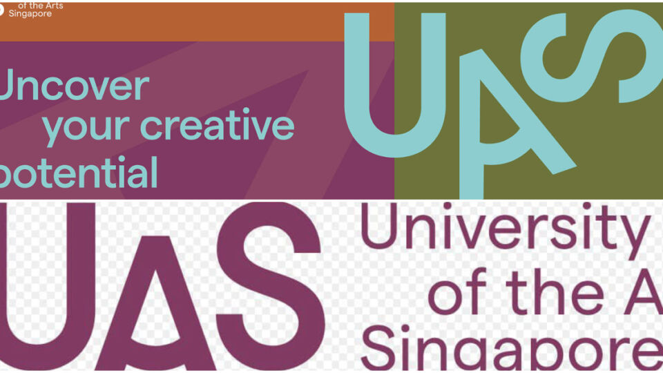
The new University of the Arts Singapore (UAS) launched its logo yesterday and its straightforward branding that just contains the letters “U”, “A” and “S” has disappointed several commenters on social media through discussion threads.
“First 2 are the official ones and last one is a screenshot of their homepage. 😱😱😱 #nowords #ikennut what do you guys think?” Arts writer Ong Sor Fern said.
According to UAS, the logo is meant to encapsulate the “dynamic spirit of an arts education and its nature to never stand still.”
It is also versatile and made like that so that it can be “dynamically reconfigured into various different permutations” to reflect the “dynamism of an arts education.”
But users aren’t buying this.
Most expected much more from an arts institute, calling the logo “lazy” and “bland.”


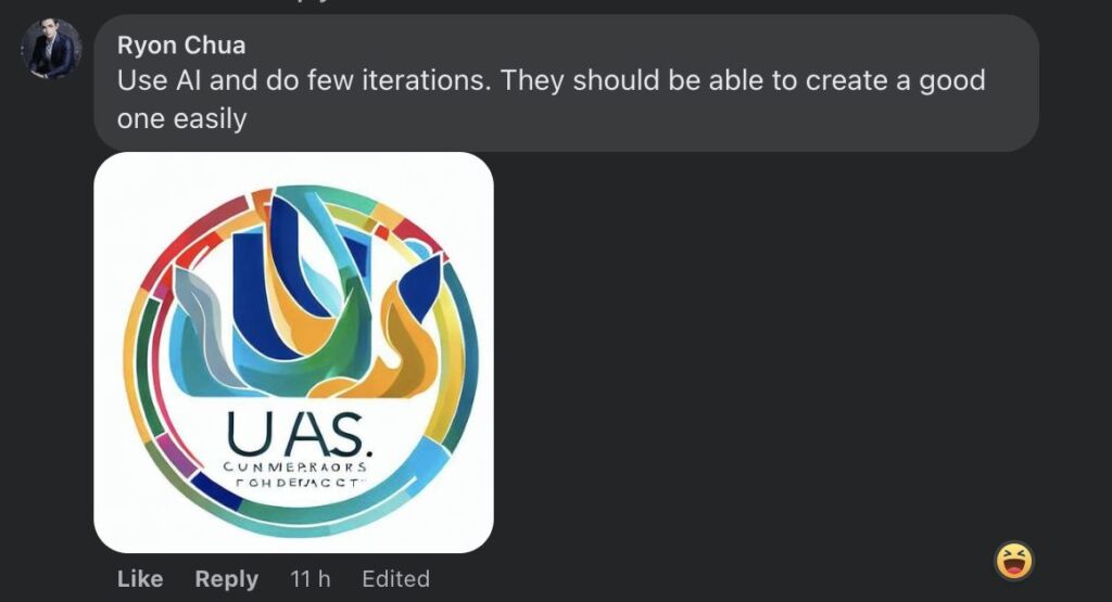
One user even generated one using the trusty AI that turned out to be a way more colorful design he thought would suit the school better.

Redditor trolls also gave their two cents with one joking that the school would task students to come up with a new logo when school starts, while others shot it straight down.


But there were some that defended the logo saying that maybe they were going for “simplicity” and having a more complicated design would compromise them.

UAS is Singapore’s first private but government–supported arts university that will be taking in its first batch of students in August next year.
Over 700 students are expected to enroll in the university that is formed between two existing art schools Lasalle College of the Arts and the Nanyang Academy of Fine Arts.
Applications will be accepted later this year.
Other stories you should check out:


