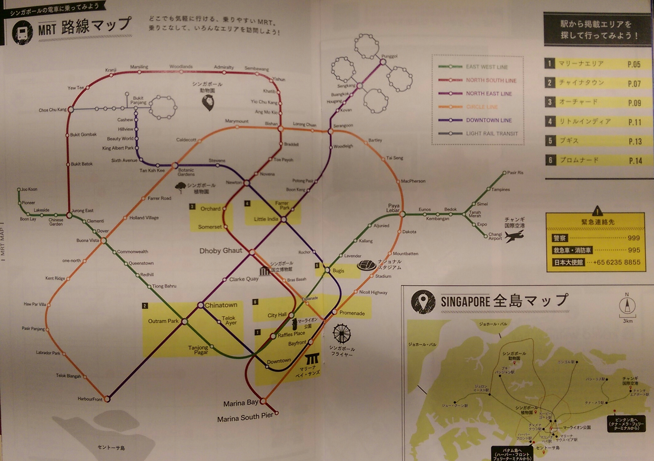
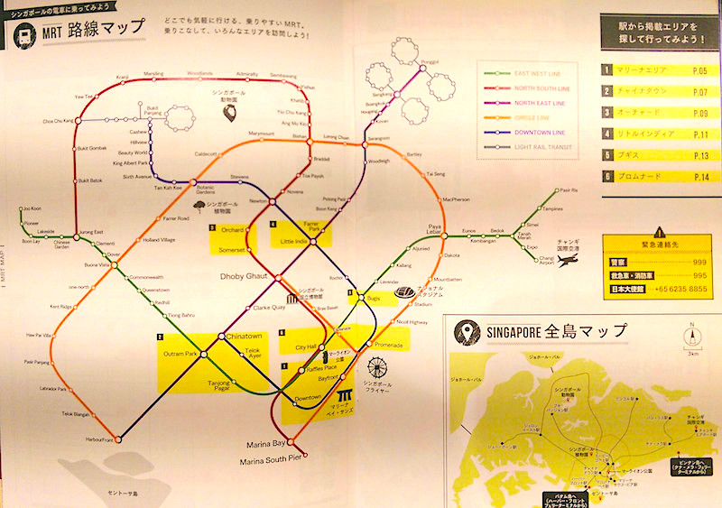
Snapped by Redditor /u/eimeimosong and uploaded on Imgur, this version of Singapore’s MRT map can be found in the guide to Singapore published by Japanese travel agency JTB Corporation. It’s curvy, it’s less loud, and it’s way more zen to what we’re used to.

Compared to the Japanese rendition, our own MRT and LRT system map looks pretty rigid and a tad bit too cramped. Less curvy and way more squarish (just like Singaporeans (oh snap)), it doesn’t look pleasing. Practical, sure — but it doesn’t seem chill at all.

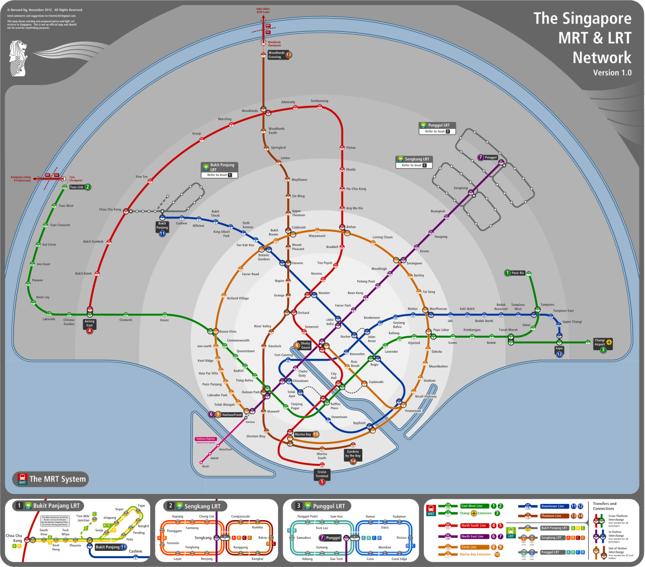
The Japanese aren’t the only ones trying their hand at inserting a little aesthetic into our train system map. Back in 2013, designers Yilun and Bernie Ng published their own versions — one of which included the Circle Line being an actual circle.


