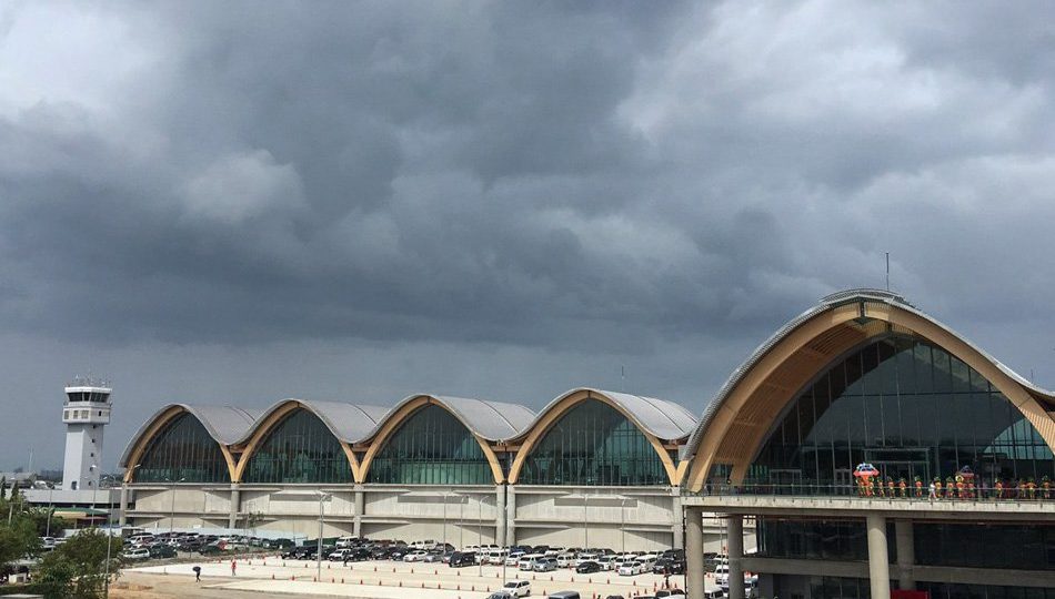
When Philippine President Rodrigo Duterte unveiled the newly-built terminal of the Mactan-Cebu International Airport last week in Lapu-Lapu City, he was so impressed with its design that he quipped in Filipino and English: “I can’t believe how beautiful this is. What a beautiful airport — I’m actually jealous. I was a mayor of Davao. I’d also like the Davaoeños to enjoy what you have here.”
The 65,500 square-meter airport’s resort-themed terminal was conceptualized by architectural and interior design firm BUDJI+ROYAL Architecture+Design, while its furniture was designed by Kenneth Cobonpue, whose clients include Queen Sofia of Spain and Angelina Jolie.
They also collaborated with Hong Kong-based architectural firm Integrated Design Associates (IDA) and owner and contractor GMR MEGAWIDE Cebu Airport Corporation, which hired all companies for the project.
IDA was in charge of the “science [aspect] of the design,” said architect Royal Pineda of BUDJI+ROYAL in an interview with Coconuts Manila.
He said IDA made sure that “the airport meets [design] international standards.”
Pineda said: “We [BUDJI+ROYAL] made sure that it [the terminal] has the architectural identity, character, soul of modern Filipino. Working with Kenneth [Cobonpue] was the perfect collaboration.”
The first concept that GMR-Megawide had in mind was somewhat similar to the Sydney Opera House, remembered Pineda.
“The original design looked more like a sail [of a galley],” he Pineda. “[But] this [the final] design is inspired by Cebu. If you look at it, the roofs are smooth, in terms of the fluidity of the curves. The design was inspired by waves.”
ABS-CBN noted that the airport also looked like an overturned boat hull. Cebu, where Ferdinand Magellan was killed by natives in 1521, was part of the galleon trade during the Spanish Occupation. The first ever galleon that departed from the Philippines was the San Pedro, which left the port of Cebu for Acapulco, Mexico.
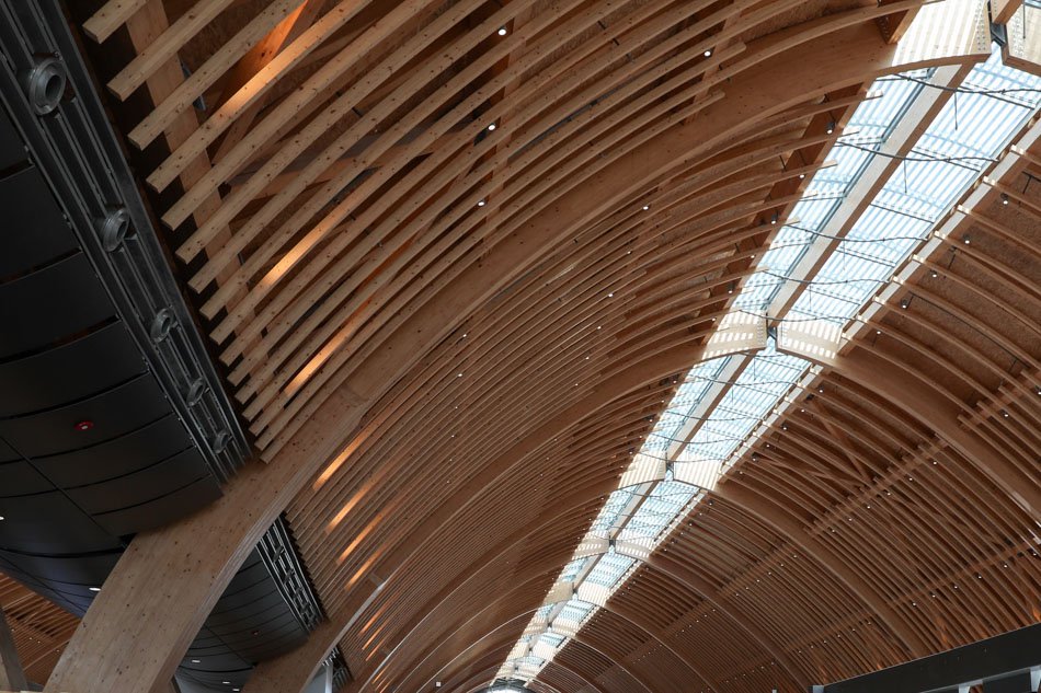
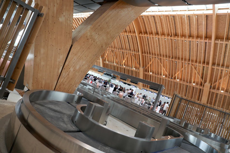
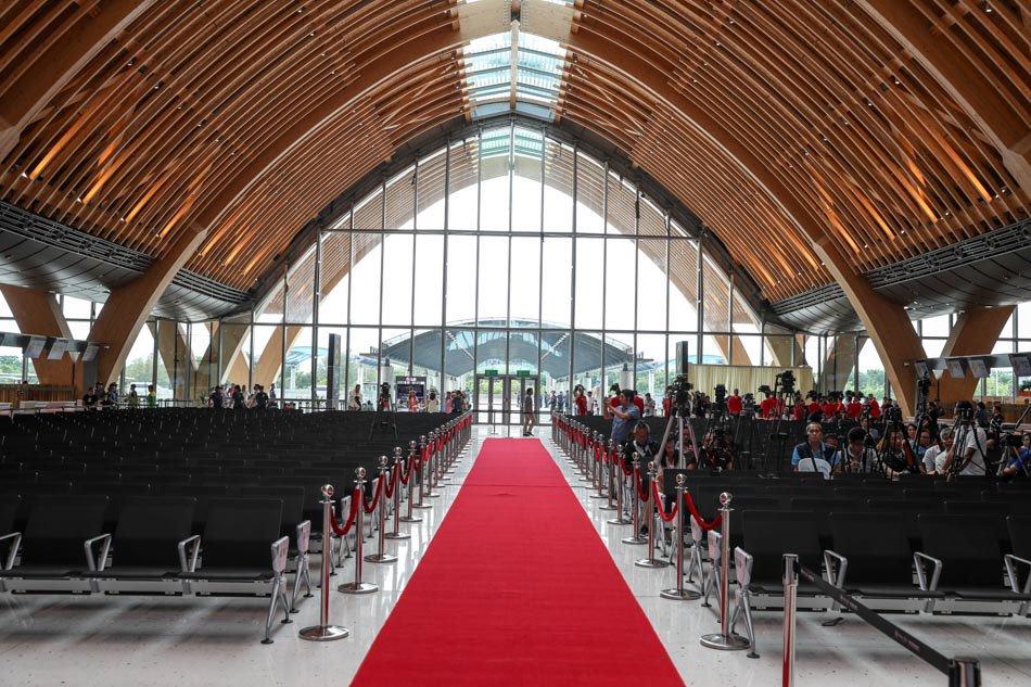
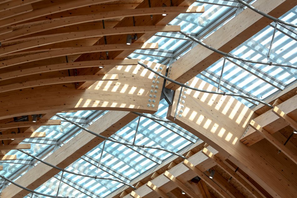
Most of the structure used glue-laminated wood from Austria. “The only steel you see are the joints,” said Pineda. “If you use steel, it would look industrial. It would not represent the island [Cebu]. They also need to make the steel look warmer. The costs would also be impractical.”
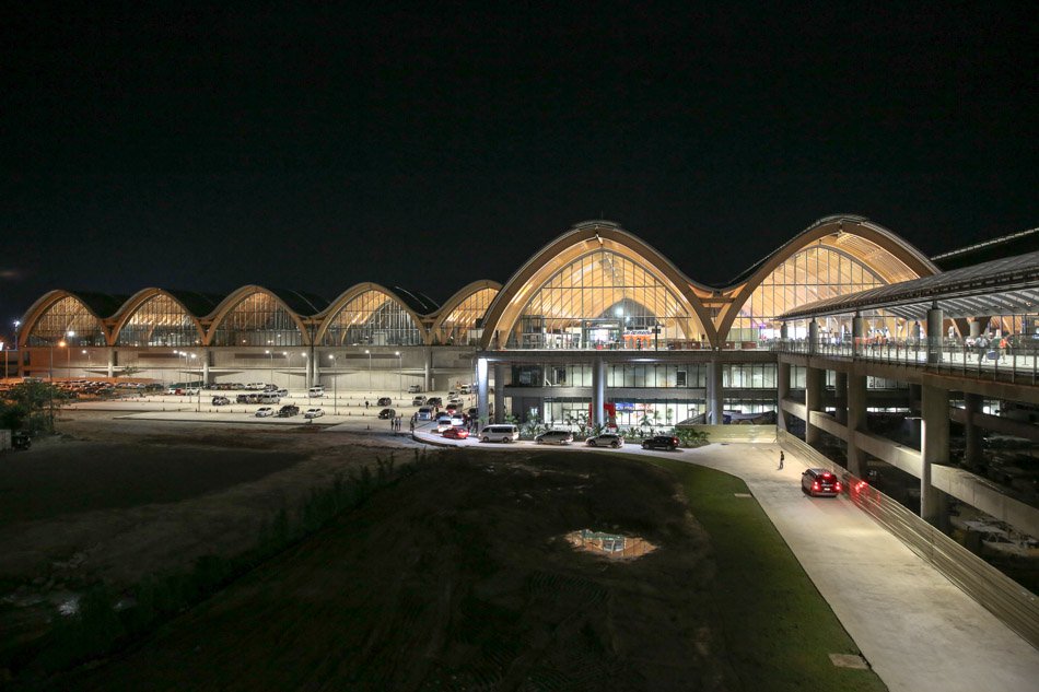
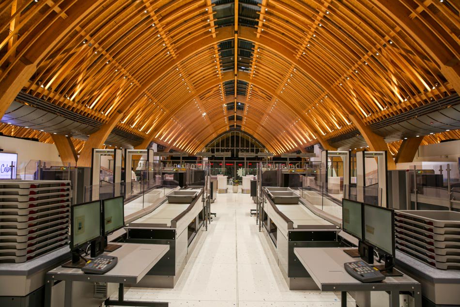
The ceiling’s design is inspired by the locally-made weaves that Cebu produces.
Cebu happens to be the capital of furniture-making in the Philippines and serves as the home of many artisans. Said Pineda: “The rafters, framings, all are exposed to represent the layers of weaves.”
Its ceilings are also relatively higher than older airports to minimize the use of electricity.
“So that daylight can be seen [from inside the terminal],” according to Pineda. “[The terminal] is not very reliant on artificial lighting. It’s not like old airports that are very enclosed.”
The floor, which was done with a granolithic finish, also emits a beachy vibe, thanks to a design detail that was embedded within. “There are shells on the floor. So it’s like walking on the beach,” said Pineda.
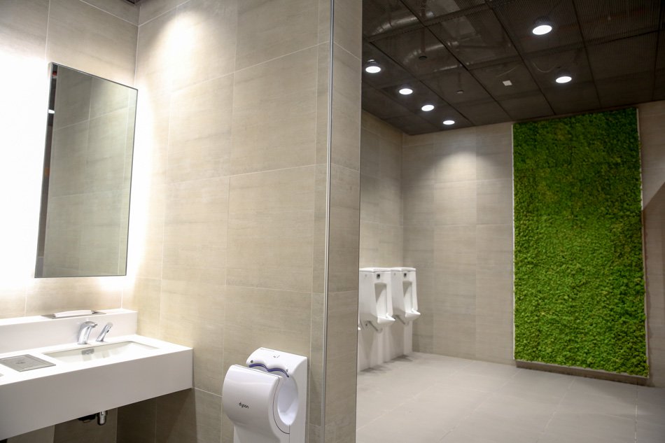
There is also a patch of greenery mounted on the toilet rooms’ walls.
“That’s actually moss. It gives an anti-bacterial effect inside the toilets. It helps to sanitize the space,” Pineda said.
Pineda is understandably proud of their work, which will start commercial operations on July 1.
“We tried to be as honest as possible. If you look at the bahay kubo (nipa hut), there’s a truthfulness to its approach,” he said.
And based on the photos, the team’s dedication to authenticity proved to be the right strategy.
CORRECTION: This article previously stated that the airport was inspired by ships. It is, in fact, inspired by waves.
