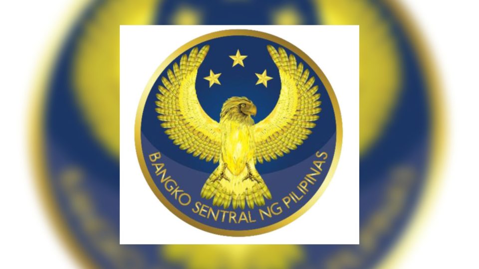
Filipinos are an artistic group of people, but when it comes to designing logos, our government appears to fail spectacularly at it (remember the controversial Southeast Asian Games logo?).
Today, it’s the Bangko Sentral ng Pilipinas (BSP), the country’s central bank, to become the object of ridicule after it unveiled its new logo.
The old, 10-year-old logo shows a Philippine eagle, the country’s national bird, superimposed on a blue background. It looks sleek, classy, and totally not OTT, but for some reason, the powers-that-be suddenly thought it was time to ditch it. The new version appears to be a gold Philippine eagle lying flat on its back with its wings spread out (but still alive!), with three stars on top.

The BSP said that the new image is “a brand refresh,” but it’s unclear what that means. In an interview with reporters, BSP Governor Benjamin Diokno said that the new symbol was created by the bank’s artists and emphasizes “the Philippine eagle as a symbol of strong leadership and foresight.”
Diokno added that the logo “requires an update to infuse the institution with renewed vitality, underscore its integrity and competence, and further promote the understanding of its mandates.”
OK. But dude, the new one is…unappealing. Coconuts Manila saw the feedback online, and boy, no one liked it. Let’s hear it from columnist JC Punongbayan (@jcpunongbayan), who wrote, “Sorry, but this is tacky. The old one was quite sleek and cool. Why replace it?”
The BSP has a new logo (right). Sorry pero ang tacky. The old one was quite sleek and cool. Why replace it? 🤷♂️ pic.twitter.com/UWwz9lAIGq
— JC Punongbayan (@jcpunongbayan) November 20, 2020
Former congressman and activist Teddy Casiño (@teddycasino) tweeted back, “So that it looks more fascist.”
Para mas pasista ang dating.
— Teddy Casiño (@teddycasino) November 20, 2020
@Pulitika2010 noticed that the new logo is similar to the symbol used by Gold Eagle Beer, a brand owned by the San Miguel Corporation.
New @BangkoSentral logo and… 🤣 pic.twitter.com/h7q5idGhVF
— Stella Arnaldo (@Pulitika2010) November 20, 2020
Writer Manuel Quezon III (@mlq3) wrote, “Personally everything was downhill after the original seal. This is what happens when every regime wants to leave a mark abandoning an institutional approach on the pretext of legislation updating its original charter.”
Personally everything was downhill after the original seal. This is what happens when every regime wants to leave a mark abandoning an institutional approach on the pretext of legislation updating its original charter. https://t.co/jdsmyZBZgt pic.twitter.com/UZ6oiVg16u
— Manuel L. Quezon III (@mlq3) November 20, 2020
Reporter Prince Magtulis wrote the question everyone wanted to ask, “If it ain’t broke, why fix it?”
Me on new BSP logo: If it ain’t broke, why fix it?
— Prinz Magtulis 프린즈 (@prinzmagtulis) November 20, 2020
“Based on the look of the logo, somebody’s kid needed a portfolio-builder,” joked @MerkadoBarkada.
Based on the look of the logo, somebody’s kid needed a portfolio-builder
— Merkado Barkada (@MerkadoBarkada) November 20, 2020
A netizen named @chasingrach noticed the eerie similarity between the new BSP logo and the symbol used by the international hacktivist movement Anonymous.
IDK hindi naman talaga sobrang similar but the new BSP logo somehow reminds me of this pic.twitter.com/fKoX4Uxrdn
— Rachel Hermosura 🏳️🌈❤️💚💙 (@chasingrach) November 20, 2020
So, do you like the new BSP logo? Tell us by leaving a comment below or tweet to @CoconutsManila.


