Well, this was underwhelming.
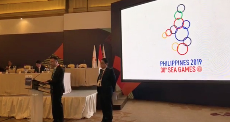
Philippine Foreign Affairs Secretary Alan Peter Cayetano has revealed the logo for next year’s Southeast Asian (SEA) Games during the Olympic Council of Asia general assembly in Jakarta, Indonesia yesterday.
He might as well not have, though, because it looks like it could’ve used a few more revisions.
The logo, comprised of 11 multi-colored circles arranged in the shape of the Philippines, was meant to symbolize the unity between the countries that take part in the biennial sporting event.
“[W]herever and whenever the games are played, we are one and we win as one,” Cayetano said.
However, the design — which looks a little bit like it was done on Microsoft Paint — did not go over well with netizens who criticized it for being sub-par.
For starters, the logo looks less like it was patterned to the shape of the Philippines and more like random circles drawn by a bored student with a compass during geometry class.
READ: Actor gets flak after saying he’ll pay a graphic designer with a ‘shout out’
Malacañang Events and Catering Services, a satirical Facebook page known to take jabs at the administration, trolled the government with its own version of the logo — one made with a pile of rubber bands.
https://www.facebook.com/MalacanangEvents/photos/a.153596708612486/256051455033677/?type=3&theater
Two hours after posting, the photo already had 779 reactions and 150 shares.
Netizens also shared their own sarcastic comments. “What is this, find the hidden Mickey?” Twitter user @RENderred said in Filipino.
https://twitter.com/RENderred/status/1031397343231242240
Many also poked fun at the logo, like @Simply_Clinton who likened it to the character Baymax from the Disney film Big Hero 6.
https://twitter.com/Simply_Clinton/status/1031367868099616768
But @choihiLario thought it looked more like a brand of cereal.
Now we know the inspiration behind the SEA Games logo…. pic.twitter.com/T6jm2AMmDA
— Choi Hilario (@choihiLario) August 20, 2018
Some also slammed the event’s mascots, with @SpongyMica saying they looked like “Molecules at Work.”
If you think our SEA Games logo is bad check out our mascots
Molecules at Work pic.twitter.com/0sLAgiR5eG
— Mica (@SpongyMica) August 20, 2018
However, some were more serious and talked about the importance of good design.
@sejoalzir said: “A national event logo should not only represent an event but also promote the culture, image, values, industries of the event sponsor. In the case of the SEA Games, the Philippines should be creatively promoted. A set of circles forming a strange-looking Phillippine map is lazy.”
A national event logo should not only represent an event but also promote the culture, image, values, industries of the event sponsor. In the case of the SEA Games, the Philippines should be creatively promoted. A set of circles forming a strange-looking Phillippine map is lazy.
— Miyako Izabel (@sejoalzir) August 20, 2018
@spacekittylei shared photos of the ongoing Asian Games in Indonesia and gave it as an example of what good graphic design looks like.
https://twitter.com/spacekittylei/status/1031370687313719296
The Philippines will be hosting the 30th SEA Games that is set to happen in November to December 2019. In an interview with ABS-CBN News yesterday, Cayetano revealed that they also plan to bid for hosting rights for the Asian Games in 2030.
If they do win the bid, let’s all hope whoever is in charge by then has better taste when it comes to logos.


