
The proposed logo for the 2019 Southeast Asian (SEA) Games in Manila has had a rough few days. Since being unveiled on Sunday, the response has been fast and largely furious.
Typical of the outcry was one netizen who said it looked like it was made by a 5-year-old.
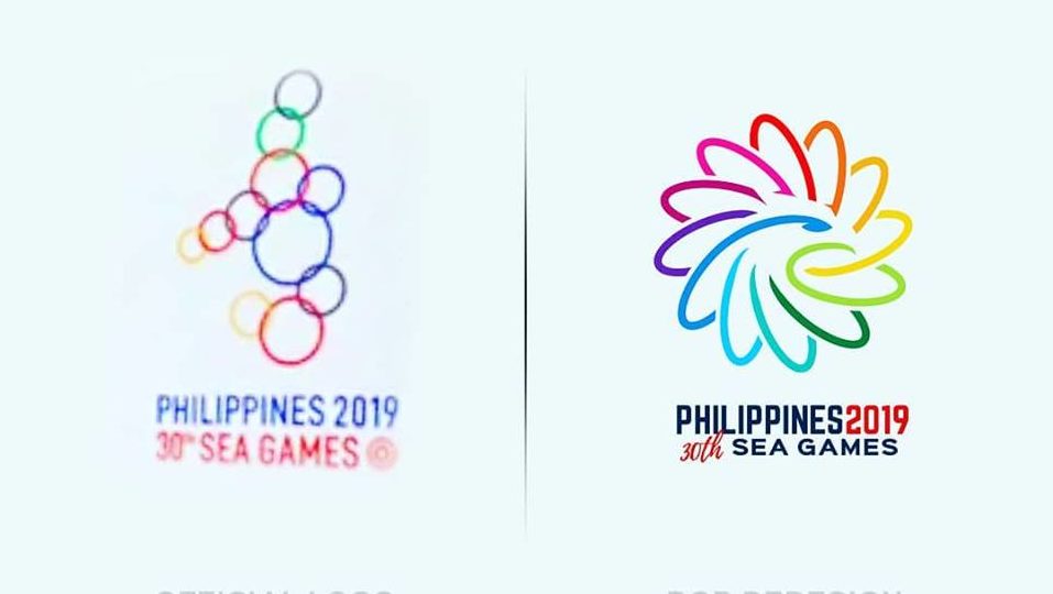
Unveiled during the Olympic Council of Asia General Assembly in Jakarta, the logo is comprised of 11 multi-colored circles arranged in the shape of the Philippines.
The circles, which could be mistaken for bubbles, are meant to symbolize the unity between the countries scheduled to participate in the biennial sporting event.
So just how despised was the logo? Enough so that several Filipino artists decided to step in and show the government how it should be done.
Twitter user @kvpingkian said he used a “blazing Philippine eagle” in order to symbolize “strength and power.”
“It has 10 feathers representing the 10 (sic) countries participating in the event and the head symbolizes the host country,” he shared in the post
The blaze, he said, symbolizes fire.
He used the eagle because it “symbolizes strength [and] power.” He explained in his tweet that the eagle in the proposed logo has 10 feathers representing each country participating in the regional event, while the head “symbolizes the host country.”
(The feathers should be 11 because 11 countries will participate in the Games.)
My version of SEA GAMES LOGO
Blazing Philippine Eagle
The eagle symbolizes strength & power. It has10 feathers representing the 10 countries participating in the event & the head symbolizes the host country. Blaze, symbolizes fire a start of something. #SEAGames2019 pic.twitter.com/gd9YWsL8IA
— Kendrick Pingkian (@kvpingkian) August 21, 2018
Facebook user Ronald Gary Bengil Bautista shared his own take on the Philippine eagle, using the multi-colored rings as his basis. He wrote: “I kept the 12 (sic) rings concept but chose another symbol to represent the country. Rather than using the map itself, I chose [to] incorporate the Philippine Eagle instead.”
Twitter user @RENderred shared his logo which combined the Philippine eagle and the sarimanok, the Maranao people’s legendary bird.
The design, he said in the post, represents the unity and majesty of the 11 countries.
Take on the 30th Sea Games Philippines Logo!
Cross over of Sarimanok & Phil Eagle represents strength in unity & majesty of the 11 countries that is represented by the 11 feathers of the Eagle. The Vinta inspired overlay on the word Philippines shows the beauty our in simplicity pic.twitter.com/HETvuduGY7
— Ren💻💭🎨 (@RENderred) August 22, 2018
Meanwhile, Twitter user @klpotente came up with what he described as a “Pearl of the Orient Sea inspired” logo.
He incorporated the sunrays of the Philippine flag to represent “purity, sportsmanship, integrity plus dignity and [the] calm of the south sea pearl or the Philippine Pearl.”
My own take of SEA GAMES LOGO
Pearl of the Orient Sea inspired.
I used the sun rays of our Philippines flag to represent purity, sportsmanship, integrity plus dignity and calm of the south sea pearl or the Philippine Pearl. #SEAGames2019 pic.twitter.com/bii8JtRitV
— K L I N E (@klpotente) August 21, 2018
Of course, all the fuss that the much-maligned SEA Games logo provided the perfect opportunity for several brands to ride on the trend.
Same-day delivery service Angkas tweeted a version using bubbles for its logo, asking its followers in Filipino: “Is this okay?”
pwede na ba #Philippines2019 #30THSEAGAMES pic.twitter.com/yeloW3EZtm
— Angkas (@angkas) August 20, 2018
Instant noodle brand Nissin Yakisoba also trolled the heck out of the proposed logo:
The Philippines will be hosting the 30th SEA Games, which are set to kick off in November 2019 — which means the government has plenty of time to come up with a more visually pleasing logo. We are sincerely wishing them luck.

