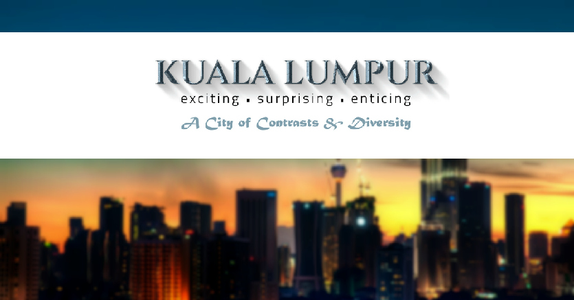

Much has been said about the new Kuala Lumpur logo, and to be honest, the comments were really negative. From ‘shameful’ to ’embarassing’, Malaysians had nothing good to say about the logo (which cost RM15,000 to design, by the way). But what do the real professionals think about it?
Spoiler alert: it’s not good.

Vijay Anand, the executive creative director of BBDO & Proximity Malaysia, told Mumbrella Asia that he initially thought the logo reveal was a “brilliant hoax campaign to prompt people to a debate about how emotional and passionate we are about the city.”
“That would have been brilliant,” he was quoted of saying. “I really thought it was a teaser to an amazing branding campaign.”
Singapore-based freelance designer Rupert England doesn’t think too highly of the logo too, saying that it looks like the result of an in-house design competition.
“There is simply no way that the person who approved this ‘brand design’ was qualified to do so. Not only does it crap on every design rule ever written, it shows a thorough lack of branding know-how,” he noted.
He added: “When compared with more considered city tourism branding, KL’s messy multiple-messaging looks desperately dated. In fact, this cannot even be defined as design.”
Pratik Thakar perhaps sums up what we Malaysians really think of the logo work: lazy.
The head of creative excellence for Coca-Cola Southeast Asia suspects the logo was designed using Microsoft PowerPoint, and the tagline “Exciting, Surprising, Enticing” is some sort of “ticking the box exercise”.
“The logo and tagline doesn’t do any justice to this unique city,” he said.
Meanwhile, a graphic design group on Facebook called Graphic Design Union also has some very strong words for those behind the logo.
In a Facebook posting which has been shared more than 1,600 times, the group compared the Kuala Lumpur artwork to logos from other cities around the world and called it “the biggest crap ever”. Yikes!

“We think that the KL logo is the biggest crap ever,” it said. “This logo is a piece of sh*t. An insult to the design industry and qualified designers out there.”
Those who are hoping that DBKL would consider redesigning the logo after the public ridicule, we have some bad news for you: they do not have plans to the change it for now, as reported by The Malay Mail‘s Nurul Huda Jamaluddin.
The city’s Tourism Bureau general manager Noraza Yusof was quoted of saying that the less-than-satisfactory logo was the result of a budget cut, as the cost of a full-blown branding “could range between RM300,000 and RM1 million.”
“We need to educate people and make them understand the brand first, the logo was only launched a few days ago,” she said, adding that the criticisms are a sign that KL-ites love their city.
Still, we are really hoping that DBKL comes out and say this in fact a clever and elaborate plan to get the people talking before they reveal the real logo. Please?

