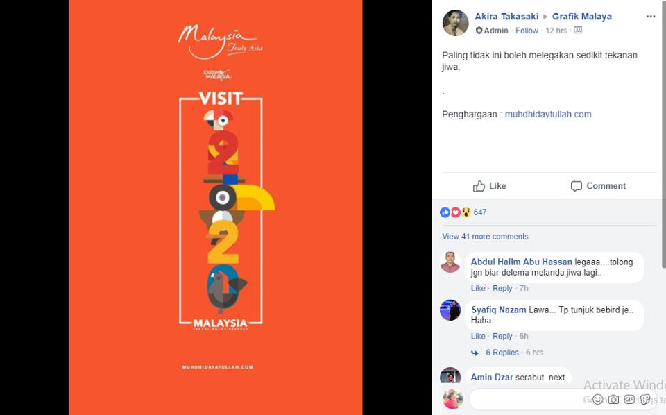
The latest Visit Malaysia Year 2020 campaign has become the butt of the internet’s joke after unveiling their new logo late Friday.
Lo and behold the artistry that is in front of your Philistine eyes:
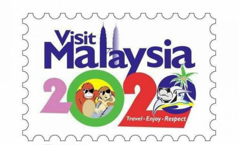
It’s a lot to take in, so we’ll break it down for you with the help of the Tourism and Culture Ministry boss Datuk Seri Nazri Aziz, who is standing firmly behind it.
- There are the Petronas Twin Towers, because of course there are the Petronas Towers. “We have to be proud of the twin towers just as the French take pride in their Eiffel Tower.” I once heard a Parisian describe the Eiffel Tower as a tolerable eyesore as they took a long drag of their Gaulois cigarette. However, we understand that Nazri means that they are are recognizable and largely identifiable with the city, so why not remind everyone, again, where those towers are, baby.
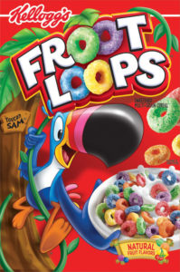
- An orangutan, wearing shades, and hugging his brother from another mother, the proboscis monkey, also wearing shades. They look like pretty cool dudes who have taken time off from their busy schedule as 1991 cereal mascots to lend a helping hand to the Tourism Ministry. Toucan Sam sends his apologies that he couldn’t make it.
- There’s a turtle on a beach, also wearing shades. It was really sunny that day.
- At the bottom are three key words we want foreign tourists to remember: Travel. Enjoy. Respect. RESPEK. Why does it feel like a half-hearted “have fun” from your mom when you were a teen, and then quickly reminding you to not do anything bad, say no to drugs, and stay out of trouble. Like, “OK … we’re just going to watch Titanic, Mom.”
- It’s all captured in a single frame that’s the shape of postage stamp. Awesome. Can we mail it far, far away?
While Nazri is standing firmly behind the ministry’s new logo, adding that he “never backtracks,” he also divulged that not a single penny was given to any fancy-schmancy creative agency to do this logo. No siree, Bob. It was all done in-house. We never could have guessed!
Confused with social media criticism being a qualifier and desire to design the logo themselves, he added: “I’d rather trust my staff than the netizens.”
With all due respect, sir, I wouldn’t trust a keyboard warrior to design my lunch, let alone a logo.
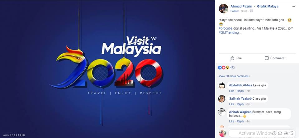
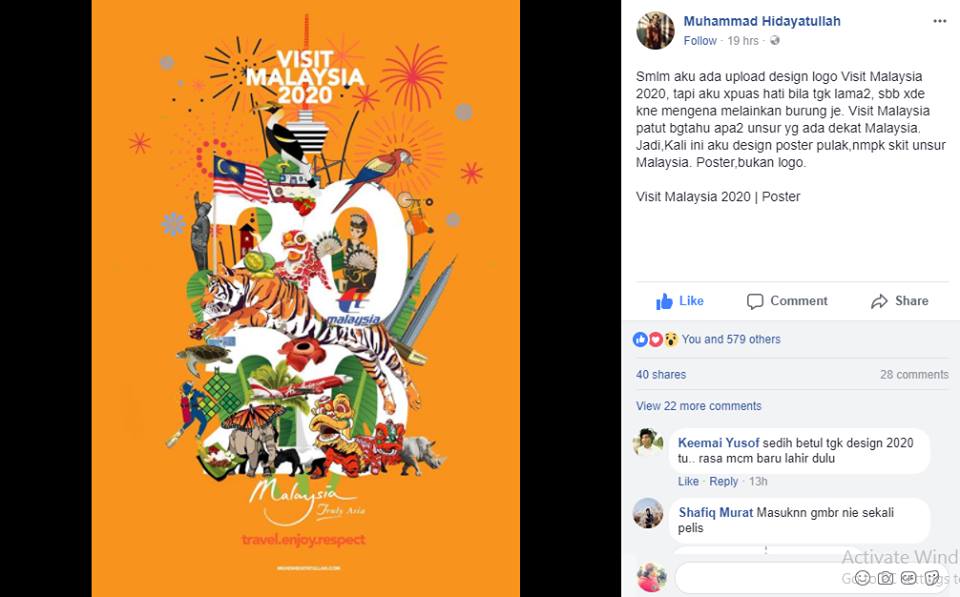
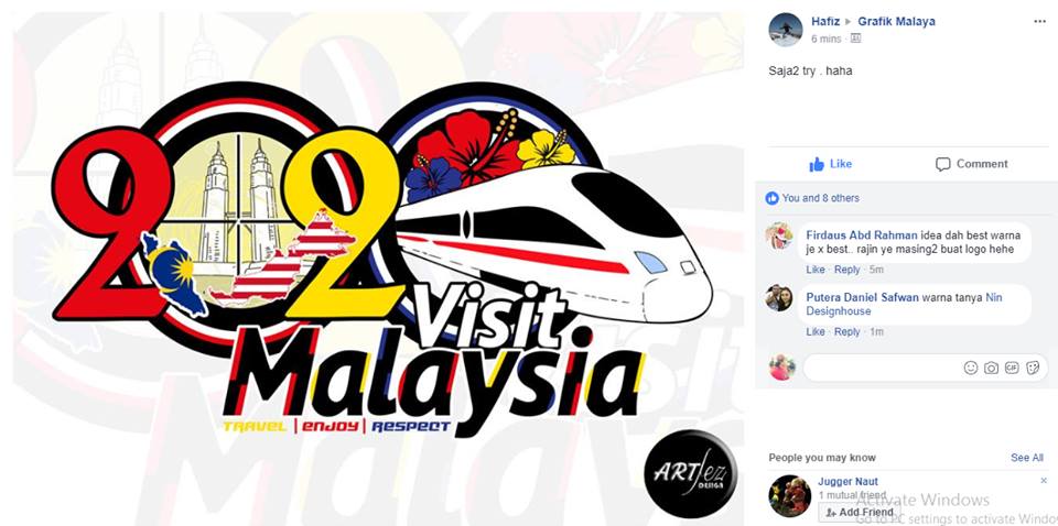
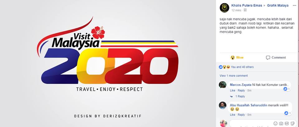
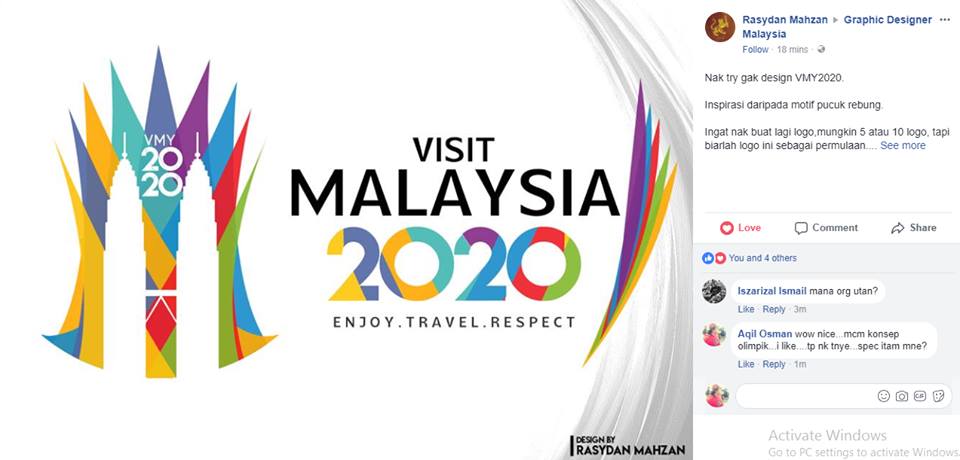
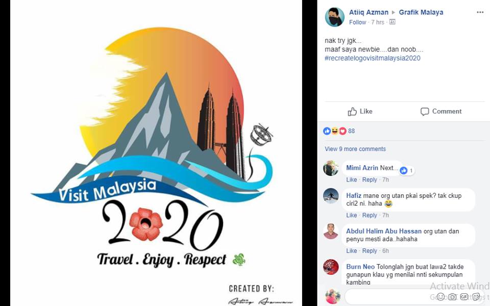
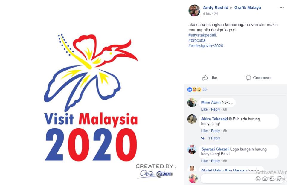
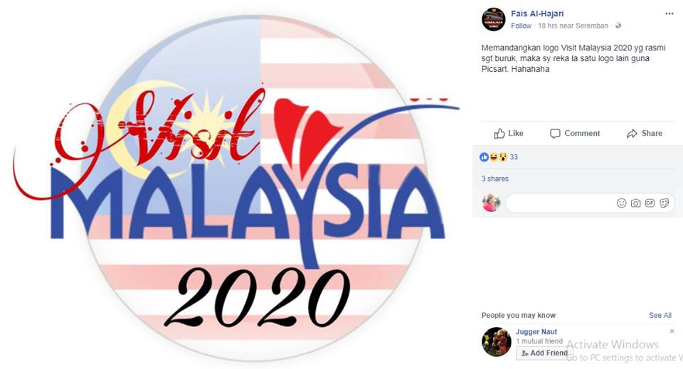
However, many netizens, who also happened to be professional graphic designers, began to devise their own contributions. One Facebook user, Aqil Osman, gathered some pretty impressive ones that you can see below.
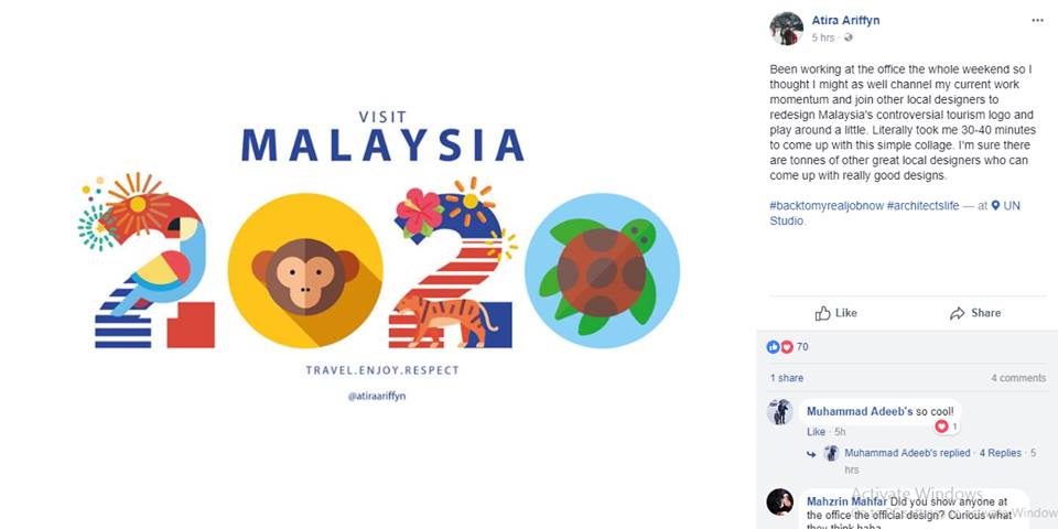
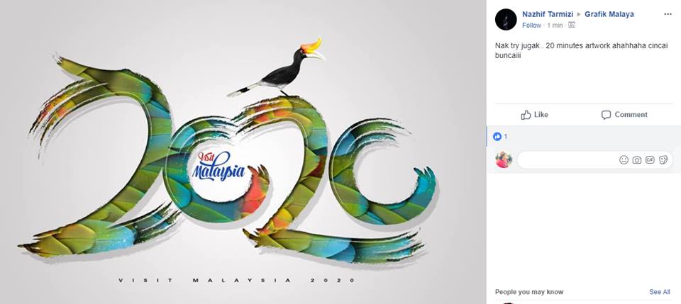
They’ve even gone as far as incorporating some of the ministry’s guidelines into their mock-ups, like keeping the twin towers, and including the animals in the logo. The ministry is concerned that “If we do not include these animals in our logo, other countries will claim them.” Hear that? Stay away Finland – don’t even try.
Have a look. It’s just the first round! The great thing about this – had the ministry hired an agency – was that they could continue the back and forth as long as they like until they have a logo that is sufficiently appalling enough to be happy with. #agencylife
Concerned citizens have started at Change.org petition, demanding that divine intervention stop the logo from being implemented. You can find that HERE.
Meanwhile, here are some more “alternatives” below: