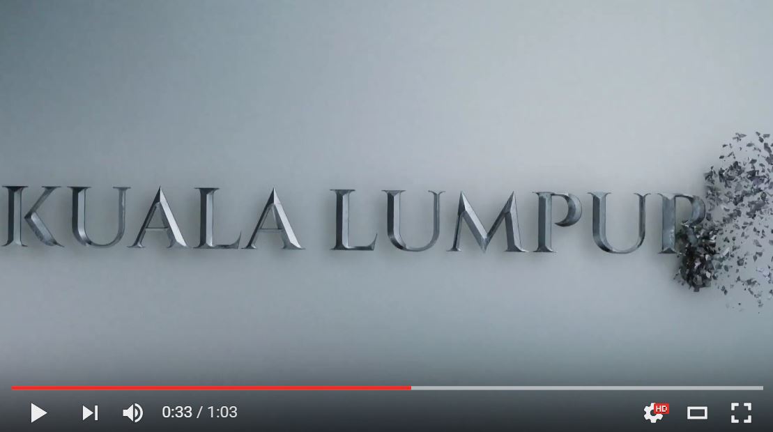
Just two days after releasing a video explaining the inspiration behind the much-hated Kuala Lumpur logo, DBKL has abruptly pulled it down.
The reason?
It was a technical error, DBKL marketing consultant Mazlan Shariff told The Malay Mail.
Mazlan told the daily that they are in the midst of rectifying the programming error and expressed hopes that the video will be re-uploaded soon.

The one-minute video was uploaded to YouTube on 3 May under the “visitklofficial” account, an attempt to dispel criticisms about the seemingly amateurish design work of the logo. Before the video was pulled offline, it received more than 720 “thumbs down” from users.
The video featured dramatic background music and special effects showing grey metal bricks slowly being chipped away to reveal the controversial logo.
In the description box, DBKL explained that the typeface was chosen to “communicate the city’s Islamic roots”, and the grayish appearance was used to “evoke Kuala Lumpur’s tin mining history”.
What the video did evoke, though, was more anger from the public.
Graphics designer Bay Chee Leong told The Malay Mail that the video as well as the logo is just plain lazy work.
“There is no concept, no effort. I’m sorry to say, but the logo and the so-called video explaining it are worse than lazy,” he was quoted of saying.
KL-based designer Syed Hamzah told the daily that the logo looked like it was made by a child – with some knowledge of Microsoft PowerPoint.
“Art and design are subjective but almost anyone will agree this is not a rebranding but an eyesore,” he said.


