
Much as we love the simplicity and utility of the Hong Kong MTR map (especially those lights that tell you which stop’s next, big ups to whoever thought of that), we know that it’s not realistic or to scale at all — for one thing, traveling two stops on the Island Line takes way less time than two stops on… well, any other line.
One dedicated Hongkonger, who posts on Reddit as twenty_characters_su has created a handy GIF that shows the condensed, linear MTR map transforming into a still-abstract but geographically accurate map, and the results are pretty damn cool:
https://gfycat.com/gifs/detail/FastUnconsciousArcticfox
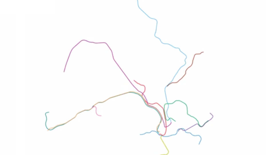
Metro map gifs have been all the rage on the DataisBeautiful subreddit this past week, after user vinnivinnivinni‘s morphing map of the Berlin U-Bahn inspired others to create their own versions. Check out some of the most popular variants:
London (topographical)
https://gfycat.com/gifs/detail/AthleticTotalHuman
New York
Shanghai

Finally, against all odds, it appears one extra-dedicated person had the time and energy to parse the jumble of hot nonsense that is Tokyo‘s metro system. Color us impressed.