
Perhaps no one’s solved the age-old question of how to explain colours to a blind person, but this might be the best attempt yet at exploring how speakers of different language perceive colours.
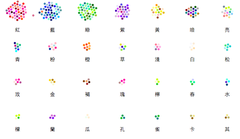
Check out this awesome animated, interactive, infographic that uses all of the Wikipedia entries for different colours in both Chinese and English to make this mind-blowing webpage.

The result is an exercise in useless but beautiful data analysis. (For one, Wikipedia is blocked in China, so the Chinese entries are not nearly as numerous as the English ones.)

We’re still not sure what the implications of this “study” are, but we’re pretty sure we would have done a lot better in school if data was always presented this way. Enjoy!

