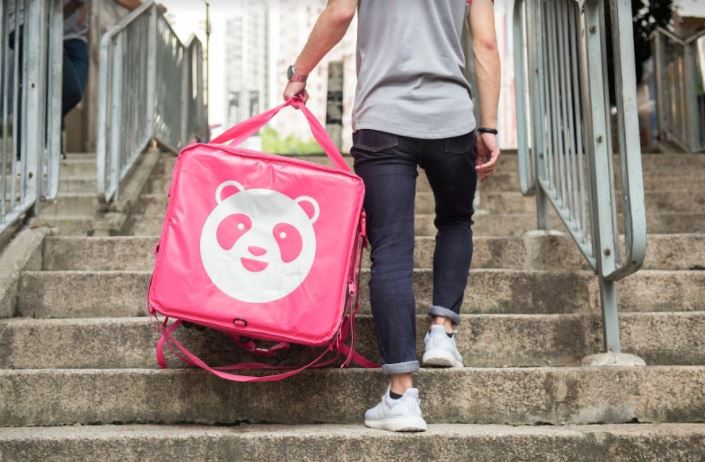
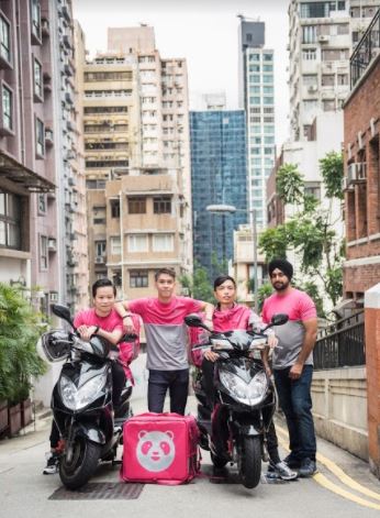
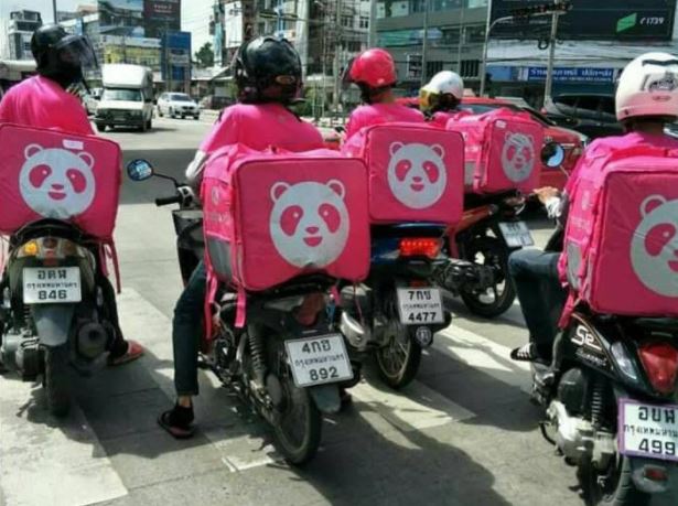
If you’ve recently opened your door expecting to see a guy in orange holding your dinner delivery, but were instead confused by a guy in pink proffering your burger or krapow — you’re not alone.
The recent rebranding of Bangkok’s most popular food delivery service, Foodpanda, means that their website interface looks brand new and every accent is pink. From the shirts and jackets of the staff to the delivery boxes to the website — it’s all pink.
In addition to the new color, the revamped website includes a dynamic live tracking delivery feature that updates delivery times minute-to-minute based on traffic and other factors. When we recently tested the feature, the driver called us within 60 seconds of the site saying he would… not that we were stalking him or anything.
Most people know the traditional thinking on hunger and colors: orange, yellow, and red supposedly stoke our appetites (which is why most fast food joints use those colors) while blue makes people feel satiated (which is why believers say you should decorate your kitchen in blue if you want to lose weight).

Armed with these vague ideas, we reached out to Foodpanda marketing chief Monika Mikusova, to ask about the new color scheme and why they chose pink.
She told us, “The distinctive pink color has an actual benefit. This color is a great brand recognition asset and is a strong differentiator for Foodpanda in markets in which orange is used extensively throughout city landscapes.”
They have also upgraded driver uniforms with reflective strips to keep them safer and more visible while delivering.
When the company rolled out the new colors on Nov. 1, Mikusova said, “We received a few messages from loyal customers that they were surprised not to see ‘their orange rider’, but overall it was positive.” The company actually had a few requests from clients asking to buy the snazzy new T-shirts and jackets for themselves.


